The day job is proving to be quite delightful, in terms of allowing me to actually spend my days working on interesting and fulfilling projects. However, quite often, I'm not actually able to blog about them until they've been 'released into the world', and by that point I've usually become distracted by the newest shiny thing I'm working on, and, as a result, never get round to showing you. I'm easily diverted.
Anyway, this was a quick, short project we did, and I can show you it now.
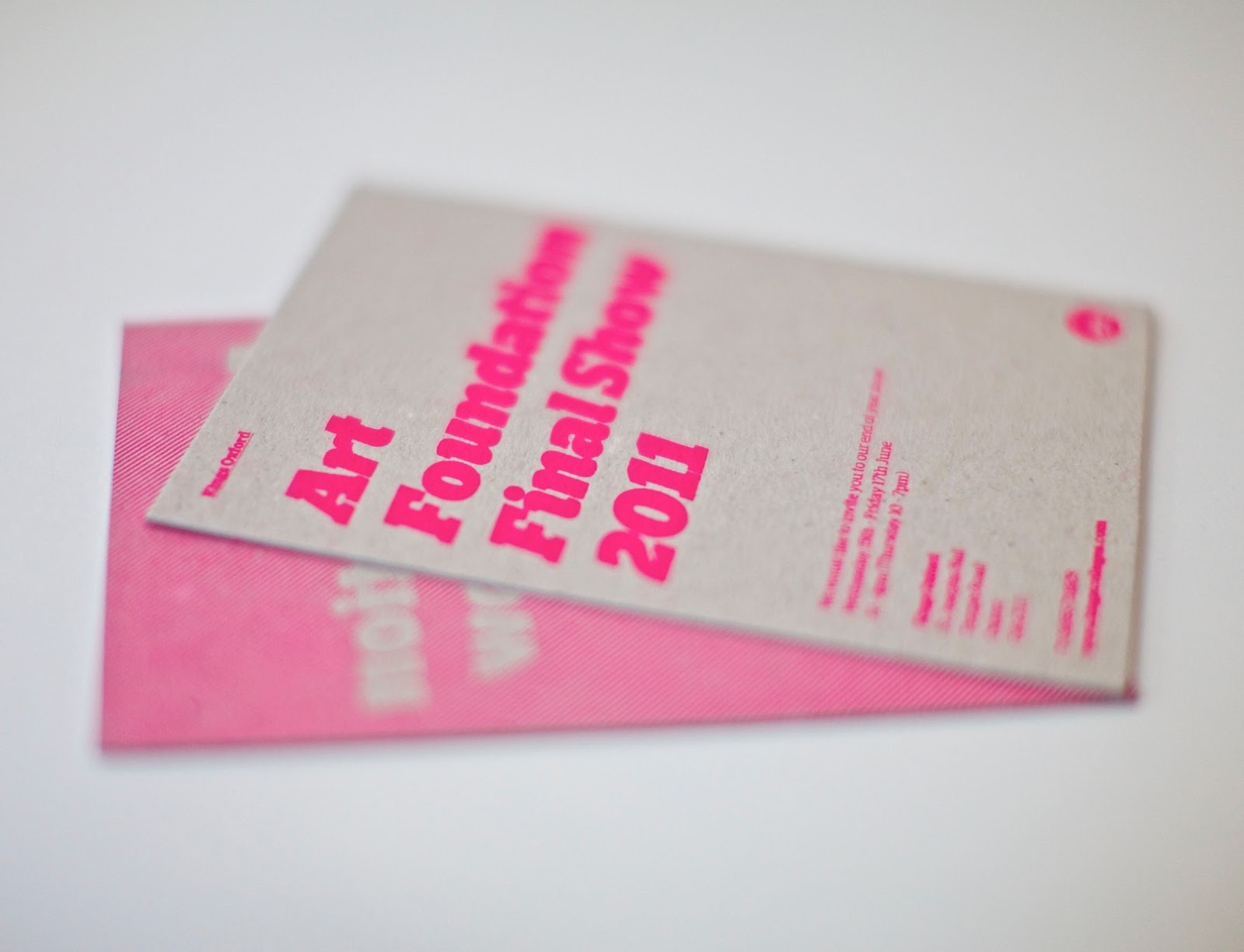
Our Oxford college runs an art foundation course, and they needed some invites for their final show.
We went for a simple, typographic treatment - it fits with the overall Kings brand, as we're using our brand typeface, and various style conventions, but we've gone easy on our use of the logo (settling for the simple circular version in the bottom corner on the back), which means that this piece is much more about promoting their show and their work than Kings as a brand.

The main challenge of this piece was actually finding a printer who could produce it. From the start, me and James were really keen on the idea of printing a fluorescent spot ink onto greyboard... it's a bit 'trendy', but I like it. For this effect to be achieved on a small scale (we only needed 100 invites), the only real solution was screen printing.
When at uni, we tending to think nothing of just getting something screenprinted, but in the real world, it's remarkably difficult to find a printer who uses this technique. After lots of research and plenty of dead ends, I eventually tracked down a lovely guy up near Haywards Heath (http://www.acresdesignandprint.com/) who was very helpful indeed, and managed to produce the invitations exactly to our specifications.
He was doubtful whether the flourescent ink would show up very bright, as - when printed on such an absorbent stock, he expected much of it would just soak in and fade away. But we were both delighted to find the invitations turned out just as vividly as we'd hoped for.


I really like the useage of greyboard in this context - for me, anyway, it has strong associations with my art foundation course: the back of sketchbooks, using it to build models, using it as a cheap cutting board and so on... it's a material I strongly associate with the 'behind the scenes' of creativity.
We actually got these done a couple of weeks ago, but I'd been waiting for our lovely photographer Wayne to take some nice shots of them for me. Thanks Wayne!

No comments:
Post a Comment